Thứ Sáu, 20 tháng 7, 2018

Mua iPhone 8 Plus hay làm luôn combo iPhone 7 Plus và iPad Air?

Cùng một mức niêm yết, giá iPhone 8 Plus đang bằng giá iPhone 7 Plus cộng iPad Air. Vậy, nên mua model mới của nhà Táo hay combo tiện lợi, đa năng?

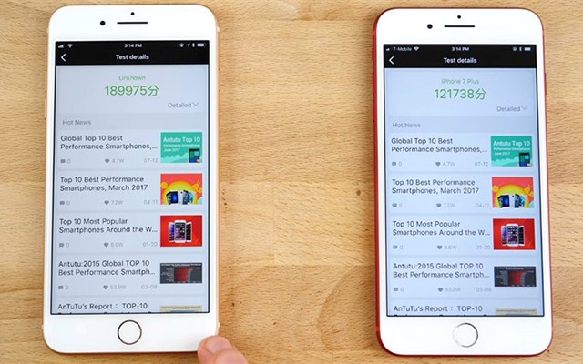
Nhìn mặt trước, hầu như không thể phân biệt được đâu là iPhone 8 Plus, đâu là iPhone 7 Plus.
Theo ghi nhận tại Di Động Việt, iPhone 7 Plus cũ hiện đang có giá 10,9 triệu đồng, iPad Air có giá 5 triệu còn iPhone 8 Plus cũ 15, 4 triệu đồng. Khi đặt ra bài toán kinh tế và ngay cả giá trị trải nghiệm, combo 7 Plus và iPad Air có phần được lòng người dùng hơn.
Cụ thể, khi so sánh riêng lẻ với nhau, iPhone 8 Plus và iPhone 7 Plus không mang tới quá nhiều khác biệt trong thiết kế hay tốc độ vận hành. Việc được Apple hỗ trợ lâu dài thậm chí viên pin nhỉnh hơn (2900mAh trên 7 Plus và 2610 trên 8 Plus), khiến model “đàn anh” có lí do để tạo sức hút trong tầm giá.
Hơn nữa, giá trị chiếc iPad Air cũng đáng để cân nhắc tại thời điểm này dù xét trên yếu tố nào đi nữa.
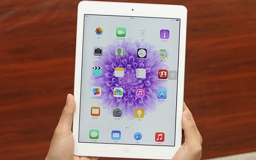
Vóc dáng cực kì mỏng nhẹ, màn hình Retina tuyệt đẹp từ 2 thế hệ iPad trước, vi xử lí A7 mạnh mẽ với kiến trúc 64-bit mạnh mẽ, màn hình độ phân giải cao 2048 x 1536 pixel, iPad Air là miếng ghép hoàn hảo cho một combo thời thượng và đa năng: giải trí, làm việc.

Ảnh
 
iPad Air rất hữu dụng trong công việc hoặc các nhu cầu chơi game, xem phim.
Ngược lại, cái giá của iPhone 8 Plus tương xứng với những tích hợp máy có được. Bắt kịp xu hướng, tính hợp thời có lẽ là điểm cộng lớn nhất trên model này. Người dùng sẽ có những trải nghiệm hàng đầu, từ thiết kế kính, camera kép tốt, cấu hình mượt mà, nền tảng tối ưu.

Tóm lại, cùng một số tiền bỏ ra, nếu bạn là người thích bắt kịp xu hướng mới, hãy tậu iPhone 8 Plus, còn nếu là người kinh tế, muốn được trải nghiệm nhiều món đồ chơi công nghệ, hoặc có nhiều nhu cầu khác song song, thì chọn bộ đôi iPhone 7 Plus và iPad Air rất hợp lí.

Độc giả có thể tham khảo các dòng iPhone quốc tế đáng mua, bán chạy trong tháng 7 tại Di Động Việt như iPhone SE 3,2 triệu, iPhone 6 giá từ 3,5 triệu, iPhone 6 Plus từ 5,1 triệu, iPhone 6S giá từ 3,5 triệu, iPhone 6S Plus giá từ 5,7 triệu đồng…

Khi mua iPhone quốc tế cũ tại đây, khách hàng được tặng kèm cáp, sạc, ốp lưng. Máy được bảo hành 6 tháng, bao test một đổi một trong 33 ngày, dùng thử 7 ngày miễn phí và bảo hành pin một đổi một trong 12 tháng. Di Động Việt còn cung cấp gói bảo hành cả rơi vỡ trong vòng 12 tháng, giá giảm 30% chỉ còn 370.000 đồng.

Theo Tạp chí công nghệ.
http://www.thongtincongnghe.com/article/75772#utm_source=feedburner&utm_medium=feed&utm_campaign=Feed%3A+ttcn+%28TTCN+-+Tat+ca%29 
 

SPOTIFY ADMITS ADDING A BLOCK FEATURE IS A "GOOD IDEA" BUT HAS NO PLANS TO IMPLEMENT IT

Spotify admits adding a block feature is a

Almost every decent service has an option that allows users to block other users for whatever reason they wish. However, some companies don't think that allowing users to take advantage of such a feature is a good idea.

Spotify doesn't have a block option yet, so you everyone can see what you're listening at any given moment if they know your username. A report by Buzzfeed published yesterday offers an example of why Spotify should add a block feature as soon as possible.


Consumers had been asking Spotify to implement this particular feature for years, and it was only this year that the company has decided to switch the status update of the block feature request to “good idea.”

Unfortunately, even though it believes that this is “a strong idea,” Spotify says that adding the block feature to its music streaming service is not on its current roadmap for the moment.

source: Buzzfeed via 9to5google 

MICROSOFT SURFACE GO VS APPLE IPAD: COMPARISON


Microsoft Surface Go vs Apple iPad: comparison
 
Microsoft has a new and affordable tablet in town: welcome the Microsoft Surface Go, a 10-inch tablet with the Windows experience on board, support for a pen, a neat adjustable hinge and a few other extras.

So... should you buy this new Surface? When faced with this question, most people will have to make the choice between the new Surface Go and the other big name in tablets: the Apple iPad.

In order to compare the new Surface Go to the iPad, let's first take a look at the families of Surface devices and iPads to understand which iPad should we compare it to.

Microsoft's lineup of Surface devices:

  • Surface Book: a 2-in-1 with detachable tablet mode, prices from $1,200
  • Surface Laptop: a traditional Windows laptop made by Microsoft, prices from $800
  • Surface Pro: a 12.3-inch tablet with attachable keyboard cover, support for Intel Core i series chips, prices from $800
  • Surface Go: a 10-inch tablet with a lower-power processor, but still running full Windows, prices from $400

Apple's iPad lineup:

  • iPad Pro 10.5" prices from $650
  • iPad Pro 12.9" from $800
  • iPad from $330
  • iPad mini 4 from $400

The specs


Microsoft Surface Go

Judging by price and size, it's clear that the new Surface Go is a direct competitor to the 9.7-inch 6th generation Apple iPad that retails for slightly less than Microsoft's tablet.

First, let's take a look at the difference in screen size and technology: the Surface Go sports a 10-inch PixelSense display with a 3:2 aspect ratio and a resolution of 1800 x 1200 pixels, while the iPad has a 9.7-inch screen with a 4:3 aspect ratio and a 1536 x 2048 pixel resolution. Both are two very sharp display, but you get a slightly sharper screen on the iPad.

Also, both tablets support pen input. The Go is compatible with the Surface Pen, allowing 4096 levels of pressure, and the iPad supports the Apple Pencil. The Go weighs 1.15 lbs, a little heavier than the iPad, but also about half a pound lighter than the beefier Surface Pro.

Apple 6th gen iPad

Under the hood, the Surface is powered by a 7th-Generation Intel Pentium Gold processor. This gold processor is the big question mark in the whole Surface Go idea as we are yet to see whether it will be powerful enough to drive demanding Windows applications. The iPad, on the other hand, runs on the Apple A10 Fusion chip.

You get two different storage options on the Microsoft tablet: a 64GB eMMC base model and a 128GB SSD version, while on the iPad you get to pick between a 32GB base version and a 128GB one.

In terms of battery life, the Surface Go official numbers are slightly lower than those of the iPad: the Go is said to last up to 9 hours on a single charge, while the iPad can last up to 10 hours.

The Experience


The Surface Go runs on Windows 10, while the iPad features the latest version of iOS, and that is a profound difference in the experience.

With the inclusion of an integrated kickstand for the surface and with the well thought out keyboard and mouse experience, the Surface is a much better productivity machine, a much more convenient laptop replacement than an iPad. The support for various desktop apps is another huge benefit for those who want to get things done on the go as iOS software might be lighter, but does not quite offer as much versatility.

But then there are a few features that make the Surface Go much more practical than any iPad: first, it supports a USB-C 3.1 port for fast and easy transfer of data, and secondly, it has a microSD card slot for memory expansion.


Summing it all up, the Surface is a bit bigger, heavier, bulkier, but still fairly light and supporting the full Windows experience, while the iPad is a thin, elegant, light gadget perfect for media consumption, but maybe just not quite as good for productivity.

Finally, we should note that the Surface Go is not currently offered with 4G LTE support and you can only get a Wi-Fi one, while iPads are offered in both styles. Microsoft has promised an LTE model will come later this year, though.

So... which one would you rather get?

https://www.phonearena.com/news/Microsoft-Surface-Go-vs-Apple-iPad_id106469

APPLE THAY BÀN PHÍM CHO MACBOOK VÀ MACBOOK PRO SỬ DỤNG BÀN PHÍM CÁNH BƯỚM

Hành động của Apple là một tín hiệu đáng mừng dành cho người dùng MacBook trên thế giới, trong đó có cả Việt Nam.
Apple thay bàn phím cho MacBook và MacBook Pro sử dụng bàn phím cánh bướm ảnh 1
Kể từ MacBook 12 inch cũng như MacBook Pro Retina 2016 trở về sau, Apple đã mang đến một hệ thống bàn phím mới giúp người dùng gõ nhanh hơn cũng như làm mỏng đi đáng kể độ dày của thiết bị. Tuy nhiên tại đây lại xảy ra lỗi khiến người dùng bị "ức chế" là nhiều phím bấm bị kẹt cứng sau thời gian dài sử dụng. Tuy không chính thức xác nhận điều này ở mặt truyền thông nhưng Apple đã có một động thái rất "khôn ngoan" là chấp nhận thay miễn phí khu vực bàn phím bị lỗi cho người dùng khi họ mang thiết bị của mình đến các trung tâm bảo hành ủy quyền của hãng nếu có một trong các hiện tượng sau xuất hiện: phím bấm bị kẹt, các kí tự bị trùng lặp nhiều lần trong lúc gõ văn bản và không xuất hiện kí tự dù đã bấm phím.
Cụ thể mỗi chiếc MacBook sở hữu bàn phím "cánh bướm" sẽ được thay mới nếu xảy ra lỗi trong vòng 4 năm kể từ khi ra mắt chính thức. Tính đến thời điểm hiện tại thì chiếc MacBook 12 inch đời đầu (ra mắt năm 2015) sẽ có thời gian thay mới miễn phí đến năm 2019, với MacBook Pro 2016 sẽ đế năm 2020 và với thế hệ mới nhất 2017 sẽ là năm 2021. Một lưu ý quan trọng là việc thay mới bàn phím là hoàn toàn riêng biệt với chế độ bảo hành của Apple, chính vì thế người dùng không phải lo lắng nếu chiếc MacBook của mình đã hết Apple Care.
Chương trình bảo hành nói trên cũng áp dụng đối với các khách hàng đang sử dụng MacBook tại thị trường Việt Nam. Để tham khảo các trung tâm bảo hành ủy quyền của Apple tại Việt Nam, bạn đọc vui lòng xem ở đường link sau: TTBH Apple tại Việt Nam

Gia Phạm

Thứ Ba, 17 tháng 7, 2018

XÓA MỘT CHỮ 'A' TRONG MÃ NGUỒN KHIẾN CẢ GAME HẾT SẠCH LỖI

Nếu đã từng có dịp thưởng thức tựa game hành động có tên Aliens: Colonial Marines, hẳn các bạn cũng biết nó không phải là một tựa game xuất sắc gì cho cam. Kể từ lúc bắt đầu phát triển, nó đã gặp không ít khó khăn từ phía nhà phát triển, và bản thân game sau khi ra mắt cũng không giữ được chân người chơi vì gameplay quá tệ. Ấy vậy mà phải đến hơn 5 năm sau, người ta mới phát hiện ra lý do game quá tệ: Một lỗi chính tả sơ đẳng trong mã nguồn của game.

Đang tải Tinhte_AliensColonial2.jpg…

Thật vậy, mới đây trên trang ModDB, quy tụ cộng đồng mod game nổi tiếng thế giới, một user có nickname jamesdickinson963 đã chỉ ra lỗi chính tả trong file .ini, khiến trí thông minh nhân tạo của game cư xử rất khó hiểu. Cụ thể hơn nếu trong bản game gốc, những con quái vật ngoài hành tinh cư xử chẳng khác gì zombie, nhảy nhót lung tung thay vì cố gắng lao vào kết liễu người chơi như dự tính của nhà làm game.

Thế là từ một tựa game hành động kinh dị, Aliens: Colonial Marines trở thành trò hề trong mắt các fan của loạt phim nổi tiếng.

Vậy đâu là lý do?

Theo jamesdickinson 963, dòng lệnh dưới đây sai một cách căn bản mà mãi 5 năm trời không ai phát hiện ra:

ClassRemapping=PecanGame.PecanSeqAct_AttachXenoToTether -> PecanGame.PecanSeqAct_AttachPawnToTeather

Đáng lẽ ra "teather" phải đổi thành "tether", và chỉ một chữ 'a' cỏn con đã biến bom tấn trở thành bom xịt!

Đang tải Tinhte_AliensColonial1.jpg…

Đây là câu lệnh để game có thể đưa ra quyết định hành vi của các nhân vật NPC trong game, nhưng vì viết sai chính tả nên không thể tìm thấy hành vi tương ứng trong mã nguồn game, và quái vật hành xử ngớ ngẩn là hệ quả tất yếu. Chỉ cần xóa chữ 'a' trong đoạn mã kể trên, mọi thứ đã khác biệt hoàn toàn. Modder có công phát hiện ra điều này chia sẻ:

"Vì sao dòng chữ này quan trọng à? Có hai lý do. Phần 'AttachXenoToTether' gần như không có tác dụng gì nhiều, nhưng phần 'AttachPawnToTether' lại là linh hồn của AI trong game. Nó điều khiển cách quái vật di chuyển, tìm kiếm con mồi (là người chơi) và cách tiếp cận người chơi trong game."

Đến tận bây giờ, nhiều người hâm mộ vẫn không thể lý giải được, đó là một dự án game cả triệu Đô mà vẫn mắc những lỗi sơ đẳng đến khó tin như vậy. Nhà phát triển Gearbox và nhà phát hành Sega vẫn chưa có câu trả lời chính thức về sự việc này.

https://tinhte.vn/threads/xoa-mot-chu-a-trong-ma-nguon-khien-ca-game-het-sach-loi.2819085/

HOW TO MAKE WILDLIFE PHOTOS LOOK GREAT WITH ACDSEE ULTIMATE

With wildlife, moments are fleeting, and there are literally once-in-a-lifetime photo opportunities. While it is ideal to “get it right in the camera”, I also believe that while all photos are created in the camera, they are finished in the digital darkroom. Some moments we capture are worth a little extra work to rescue if a mistake in settings is made or the light wasn’t quite right at the time.
Out of the many software products out there to process photos, ACDSee Ultimate 10 offers an all-in-one solution to process your photos. In this article I’ll take you through how I process my wildlife images in the Develop Mode in ACDSee Ultimate to get them looking their best, or rescue shots that need a little extra help.

The Digital Darkroom

I am going to break an unspoken rule of photographers on the web, and show you one of my crappy images. To ease into this, let’s first look at the “after” image processed via ACDSee:
After pulling an all-nighter for star photography, on the drive home I came across a sandhill crane pair and their colt (with sandhills, the chicks are called colts). Having photographed them earlier in the year on their nest from egg through hatching, I was excited to see the now “teenager” lounging next to the original nesting pond. Short on sleep, I whiffed on my settings, not checking the first shots to make sure they were right. While I caught my mistake pretty early, I loved the pose and low angle of this particular image. But, this image needed some help in the digital darkroom… there were dust spots, a distracting dark area in the upper right corner, poor contrast, and flat, washed out colors. This will be our sample image as I show you how I took it through my workflow and what adjustments I used to make this colt look the way he should.

Develop Mode


In ACDSee, the Develop Mode is where we go to process our RAW photos, and make adjustments to images. Everything you do in this mode is “non-destructive” processing, so you won’t lose anything when you make an adjustment. The changes made here can be undone, no pixels are harmed in the developing of your images!
There are four tabs within the Develop Mode: Tune, Detail, Geometry, and Repair. For my workflow, I go through these in a slightly different order than presented in the program, I’ve found this gives me the best results for my wildlife photos. Keep in mind, your digital workflow should fit your style of photography and processing. Experiment with all of the settings, and find what works for you. 


Quick Tip: When in the Develop mode, you can toggle back and forth between your developed version and the original by clicking and holding the “Show Original” button in the lower left of your picture window, or pressing and holding the “Z” key.

Step 1: The Geometry Tab

The Geometry tab addresses two main areas; issues caused by your lens and camera combination such as distortion or vignetting, and issues caused by the photographer, like crooked horizons, or compositions in need of refinement.

Lens Corrections

You may be surprised how much this setting can affect your images. ACDSee has a large database of lens and camera profiles, which you can use to automatically make adjustments to correct your image based on your particular equipment.
Animals all have distinct shapes and sizes, if this is distorted in any way it can cause your image to seem “off”. Often, when something just doesn’t feel right about an image, it’s due to distortion. Using lens correction is a smart and fast way to make the perspective and dimensions of your subject look right.

Cropping

I usually crop early if it is obvious the image’s composition will benefit from it. My reasoning is I want to see the image with the right composition throughout the process. My ulterior motive is it can also remove problems, like dust spots, instead of spending time fixing them. On a big batch of files, each step you don’t have to take adds up to serious time savings!

In this case, applying a small crop refines the composition, making the colt slightly larger in the frame, and balancing the image so the colt’s eye falls closer to the upper right third. Remember when cropping, give your animal room to be alive in the frame. Too tight of a crop can cause your image to feel cramped, taking the life out of your wildlife shot.

Quick Tip: Make sure you have enabled “Snapshots” on the “View” menu. Then, get in the habit of making frequent Snapshots. Photographers have a tendency to always want to make just one more tweak. Snapshots allow you to go back to a point in your workflow, restoring all the settings from then, right before you made that “just one more tweak” that didn’t work out so well.

Step 2: The Repair Tab

This tab provides tools to remove pesky dust spots on your images. When removing spots, I prefer “Heal” over “Clone”. The Heal option usually creates a better result as it samples pixels surrounding the spot, attempting to blend in the area being repaired. To get the best results, make your brush bigger than it needs to be and add some feathering, this will blend the repaired area in even more.
Clone simply copies the pixels from wherever you right click on the image to wherever you left click on the image. While this can work well in images featuring large areas of a color, nature is rarely that simple. Usually, large areas of a solid color have subtle gradients to them. If I were to use Clone in the water on this image, and selected a source too far from the dust spot, I would pull in a different tone or hue. This results in a lighter or darker blue spot where the dust spot had been. That is not a fix, it’s replacing one problem with a new problem!
The exception though for animals is if you have a spot in an area of high detail or texture, such as scales, feathers, or fur. In these cases, I favor using Clone, as Heal may soften the texture too much, creating a noticeable soft spot in the midst of your animal’s coat.


To compare the Heal vs. Clone options, in this image of a gray fox I’ll clone out the leaf sticking to its upper hind leg. In the Heal version, there is a noticeable softening of the fur where the leaf was. In the Clone version, the fur matches more evenly and blends better. The key is to make sure you are sampling an area that is the same color, brightness, and that the fur is lying in the same direction as the area being cloned over.

Step 3: The Tune Tab

That’s “Tune” for “Tune Up”, not “Play me a Tune”. There is a lot to the “Tune” tab, encompassing exposure corrections, color adjustments, special effects, and more. You can “tune” the entire image or make adjustments only to specific areas.
When working with these tools, think “big brush” versus “little brush”. If you are painting something, you use a big brush to cover a wide area. You aren’t looking for precision, just to cover as much area as possible. You use a little brush for fine detail work, where neatness and accuracy matter. In your digital darkroom, some settings are big brushes that make global changes to the image; like exposure, saturation, and contrast. Others are little brushes, that allow you to precisely adjust a very specific part of the image; like clarity, tone curves, or Light EQ. Every tool has a use, but the big brushes are easy to overdo, causing your images to look overprocessed.
Quick Tip: Right clicking any slider will reset it to its default setting.

White Balance Panel

Correcting color is the first thing I do on the “Tune” tab. Accurate colors are especially important in in wildlife photography. If, for example, your image is used in a field guide, the animal’s colors must be true to life.
In this image, the camera on auto white balance chose a color temperature of 6140K, which created the yellowish cast you can see in the original image, especially in the water. In my colt photo, using this tool adjusted the overall image to a bluer 5500K, removing this yellow cast and making the water look a lot less muddy!
Adjusting white balance will affect all colors in the image, it is a broad brush approach. But, it is a necessary step in making sure different animal species, and their environment, look correct.

General Panel

Now that I have used ACDSee for a while, I tend to use the Light EQ panel first. But, in the case of this image, it needs some overall global adjustments at the start. Since every image is different, there are no hard rules for what you should use, or in what order, every time.

“Big Brushes”

  • Exposure – An overall adjustment for images that are too bright or too dark. It’s measured just like exposure compensation on your camera.
  • Contrast – A term thrown around a lot in photography, it is the distance between brights and darks in an image. An increase in contrast makes the shadows darker and the highlights brighter. A decrease moves both toward the middle, creating a flatter or washed out look to your image. Think of fog as low contrast and midday bright sun as high contrast.
  • Saturation – How intense colors appear. Increasing it moves the colors in the image toward their pure form, decreasing it moves them toward colorless gray.

“Little Brushes”

  • Highlight Enhancement – I admit the name threw me at first, this slider works to recover detail in areas of the image that have been “blown out” or overexposed. This is a one-way slider starting at 0, where moving to the right increases the effect. For my colt shot, sliding to 10 restored some details that were lost in the highlights.
  • Fill Light – This is the counterpart to Highlight Enhancement. It works to restore details to “blocked up”, or too dark areas. Adding 10 here also helped open up the details in the shadows.
  • Vibrance – A saturation adjustment tool for only the colors in an image that are not already highly saturated. Most images benefit from a little vibrance to add color to drab areas of a shot. For animals I usually start fairly high, around 30, and then ease the slider to the left until it looks realistic.
  • Clarity – This changes the contrast just on the midtones of your image, leaving the highlights and shadows alone. The visual effect is to make a photo crisper, giving it more definition by adding clarity. Removing clarity has the opposite effect, it can make scenes less defined, taking on a dreamy quality. For most animals I like adding clarity, starting at about 20, and adjusting from there. This makes the texture of their skin or coat really pop, eyes appear more lively, and the overall image sharper.
  • Dehaze – Similar to the Clarity slider, this restores both contrast and saturation to an image. As its name implies, this is especially useful for subjects shot in haze or fog to recover details. Even images not shot in these conditions can benefit in some cases. This is a tool that can easily be overdone however. Too much and you may see vignetting and chromatic aberration show up in your images that may not have been visible before.

Light EQ Panel

This panel tool adjusts tone levels, or the average brightness of a pixel and its surrounding pixels. You can use it to adjust images that are too dark or too light, but the real magic of it is being able to adjust different tones in specific parts of your image, without affecting other parts.
Light EQ is an extraordinarily complex bit of software that can look intimidating, but it is really simple to use.

On an area of your image where you want to adjust the tone, use your mouse to click and drag up or down to make the highlights in that area lighter or darker. Right click your mouse and drag up or down to make shadows lighter or darker. Repeat wherever you feel you need an adjustment.
Alternately, you can click directly on the equalizer graph in the Light EQ panel to make these adjustments. This graph is a visual representation of all the tones in your image, showing the amounts of highlight and shadow. As you make adjustments you will see an overlay appear on this graph showing how you are adjusting the image throughout its full range of tones.
ACDSee can also automatically set what it considers to be the ideal brightness for an area. At the bottom of the Light EQ panel is an “Auto” button, you can click this to let ACDSee take over. You can also double click an area on the image to have it automatically brightened or darkened. Personally I like to have more control over the process, but in my tests the program did a fair job when making automatic adjustments.
Light EQ works well on wildlife, I use it to enhance the details in overly dark or light areas, while protecting details in areas that don’t require adjustment. However, it is a tool that is easy to overdo. When in doubt, gentle processing is usually best!
Quick Tip: As you work with this tool, I strongly recommend using the “Advanced” option in the mode dropdown at the top of this panel. This will give you the most control to adjust the tones in your image.

Step 4: The Detail Tab

I am only going to touch on this tab briefly, as I do not use these features for many of my wildlife images. The Detail tab includes tools for sharpening and noise removal. With animals, too much of either sharpening or noise removal can add strange artifacts and make fur or feathers appear unnatural. I prefer to apply these very lightly in wildlife images, if at all, using other tools like clarity to give a sharpening effect.

And…Done!

These are all the adjustments this particular image needed. While there are other features available in ACDSee to edit your images, if you have gotten it close in the camera, the settings I have covered will get you great results in the digital darkroom for your wildlife photos.
Remember, you are working with RAW files, so don’t be afraid to experiment. Take Snapshots often, and push each slider to its extreme to see the results. If you don’t like what you produce, you can always reset and start over, the best way to learn is by getting in there and trying it out!

https://photofocus.com/2017/07/05/how-to-make-wildlife-photos-look-great-with-acdsee-ultimate/ 

Thứ Hai, 16 tháng 7, 2018

SURFACE GO - VÁN CƯỢC LỚN CỦA MICROSOFT VÀO MỘT CÁI MÁY TÍNH NHỎ TÍ NHƯNG LIỆU CÓ THÀNH CÔNG?

Surface Go là chiếc máy tính mới nhất của Microsoft, nó vẫn là Surface nhưng nhỏ gọn hơn và đặc biệt là rất rẻ, giá chỉ từ 399$ mà thôi. Đây là ván cược của Microsoft để đưa máy tính lai đến với nhiều người dùng hơn, để cho các hãng khác thấy được một cái máy lai tốt nên là như thế nào, và đây cũng là một ván cược để giúp thương hiệu Surface chạm được tới nhiều khách hàng hơn. Bên dưới là bài kể lại của anh chàng bên trang Wired khi được Microsoft mời tới nơi đã sinh ra Surface Go (cũng như tất cả các máy Surface khác của công ty).

Panos Panay là người thích đặt cược. Bạn có thể thấy rõ điều này khi đi vào tòa nhà Microsoft Build 37. Ở đây có hai tờ $1 đang nằm dưới một chiếc Surface nằm trên kệ.

Khi tôi hỏi Panay về những tờ đô la này, ông nói đó là một sự đánh cược mà ông đã đưa ra vài năm trước mỗi sản phẩm mới được giới thiệu. Khi tôi hỏi liệu đó có phải là ván cược cho chiếc Surface RT hay không, ông nói "Tôi có lẽ đã thua ván đó, lần này tôi sẽ thắng". Tất nhiên tất cả đều là tự nguyện.

Panay hiện đang là giám đốc sản phẩm của Microsoft, ông dắt anh bạn bên trang Wired đi không phải để nói về quá khứ của Surface, cũng không nói về hiện tại. Thay vào đó, ông nói về tương lai của Surface thông qua chiếc Surface Go. Nhưng nếu bạn gọi đây là một sản phẩm "lớn" hay "át chủ bài" thì không đúng rồi, bởi chiếc Go được làm ra để biến mất.

Đang tải msftsurface-8.jpg…
Panos Panay

Nếu bạn đã theo dõi Surface trong nhiều năm qua thì có lẽ bạn đã nghe hay thấy Surface Go dưới nhiều hình thức, và Surface Mini là một trong số đó. Nhưng Panay khẳng định chiếc máy tính 2 trong 1 mới này không giống bất kì thứ gì đã được hãng ra mắt. Nó không phải là Surface RT, cũng không phải Surface 3, và cũng chẳng phải là Surface Mini luôn.

Thay vào đó, Surface Go là một nỗ lực mới để đem những tính năng cao cấp của chiếc Surface Pro giá 1000$ xuống phân khúc thấp hơn, giá rẻ hơn và nhỏ gọn hơn.

Giống Surface Pro, chiếc Go cũng là dạng tablet detachable, tức là phần tablet có thể gỡ ra khỏi vỏ bàn phím Type Cover. Nó cũng sở hữu cùng một bộ khung ma-giê, màn hình cảm ứng độ phân giải cao tỉ lệ 3:2 phủ kính Gorilla Glass, chân chống có thể nghiêng tối đa 165 độ, hỗ trợ bút cảm ứng Surface Pen, nhận diện gương mặt Windows Hello, camera sau 8MP... Nói chung đa số những gì Surface Pro có thì chiếc Go cũng có.

Đang tải Surface_Go.jpg…

Nhưng Surface Go nhỏ hơn đáng kể. Nó sử dụng màn hình chỉ 10" thay vì 12" và nhẹ chỉ 520g. Nó có thể nhét vừa vào một cái túi da cũng như cách mà bạn nhét quyển sổ tay của mình vào vậy. Lần cuối cùng tôi nhìn thấy một chiếc máy tính nhỏ nhẹ như vậy là YogaBook năm 2016.

Surface Go cũng là chiếc Surface rẻ nhất từ trước đến nay, giá chỉ 399$ cho cấu hình thấp nhất. Với số tiền này bạn sẽ có bộ nhớ trong 64GB, RAM 4GB, cài Windows 10 Home. Type Cover và bút thì phải mua riêng.

Đây không phải là lần đầu tiên Panay và nhóm của ông làm tablet 10". Chiếc Surface đầu tiên đã sử dụng màn hình 10,6" rồi. Năm 2015, Microsoft cũng ra mắt chiếc Surface 3 sử dụng màn hình 10,8" sau sự thành công vang dội của chiếc Surface Pro 3. Chiếc máy này thời đó có giá từ 499$, chạy Windows đầy đủ chứ không phải Windows RT, phiên bản bị ruồng bỏ của Win 8 nhiều năm về trước, nhưng chiếc Surface Pro 3 lại không có nhiều sức mạnh và cơ chế sạc không tốt.

"Tới ngày hôm nay tôi cảm thấy rất tiếc cho cổng sạc của Surface 3. Tôi nghĩ rằng sự phổ biến của cổng USB 2.0 sẽ giúp giải quyết câu hỏi: Liệu tôi có thể sạc được Surface 3 với cục sạc tôi đang có hay không. V2 thứ tôi học được đó là người dùng muốn một trải nghiệm sạc đơn giản, dễ dùng. Tôi biết rằng việc này rất nhỏ nhặt nhưng tôi cũng không thể gạt bỏ sự thật rằng mọi chi tiết nhỏ đều có thể tạo ra những khác biệt lớn".

Panay nói ông thấy rõ nhu cầu về một chiếc máy thay thế được cho Surface 3, và theo lý thuyết nó sẽ là Surface 4. "Nhưng tiến hóa theo kiểu đó thì không ổn. Nó sẽ quá giống với chiếc Surface Pro đầu tiên, và sản phẩm không nên như thế." Thay vào đó Microsoft đã ấp ủ và phát triển chiếc Surface Go trong 3 năm qua, và đặt tên mã cho nó là Libra.

Surface Go học hỏi từ những sai lầm của Surface 3. Nó có cổng sạc Surface Connect hoặc sạc bằng cổng USB-C cũng được (bên cạnh tác dụng truyền dữ liệu). Pin của máy có thể đạt tới 9 tiếng, chạy chip Intel Pentium Gold, tuy chưa phải là chip cực mạnh nhưng vẫn hơn nhiều so với CPU Atom của Surface 3.

Đang tải 4358300_Surface_Go_Specs.jpg…

Microsoft cũng đã làm việc chặt chẽ với Intel để tinh chỉnh chip cho phù hợp với Surface Go. Nếu so với Surface Pro 3 chạy chip Intel i5 thì Surface Go có sức mạnh đồ họa cao hơn tới 33%, còn nếu so với bản i7 thì nó mạnh hơn 20% trong khi dòng chip chỉ là Pentium. Đồ họa tích hợp thế hệ mới trong chip Intel đóng vai trò quan trọng trong việc giúp Surface Go chạy nhanh.

Phần mềm của Surface Go cũng được điều chỉnh, từ Office cho đến Windows, để cho phù hợp với một chiếc máy tính 10 inch. "Chúng tôi mời team Cortana tham gia vào và nói cho họ biết người dùng cần gì ở một cái máy nhỏ như thế này". Surface Go cũng có cơ chế tự động scale ứng dụng để giúp các app bên thứ ba chạy tốt mà không bị bể. Microsoft cũng làm việc với một số bên khác để đảm bảo app chạy ngon.

Thu nhỏ chiếc Surface Go cũng không phải là chuyện đơn giản: bạn phải làm sao để nhét vừa hết linh kiện vào một cái thân hình nhỏ 9,6"? Việc chọn vỏ ma-giê là chuyện quá dễ, nó nhẹ hơn 36% so với nhôm và Microsoft đã tạo ra các cơ chế kĩ thuật để sản xuất vỏ ma-giê. Một vài chỗ trên thân hình của chiếc Go được làm mượt hơn, bo hơn để dễ cầm nắm trong thời gian dài.

Đang tải msftsurface-4.jpg…

Thách thức lớn nhất với team Microsoft là bàn phím Type Cover. Ngón tay của con người không nhỏ đi theo máy nên nếu bạn cố làm bàn phím bé tí chỉ để máy mỏng nhỏ nhẹ hơn thì sẽ rất khó gõ. Điều đó dẫn tới cảm giác không thỏa mãn. Hay tệ hơn, bàn phím có thể bị gãy. Microsoft đã phải làm rất nhiều để có thể thu nhỏ lại bàn phím một tí trong khi vẫn giữ được sự thoải mái khi nhập liệu và hành trình phím cũng chỉ ngắn hơn một chút xíu so với Type Cover của chiếc Surface Pro.

Chưa hết, bàn phím này còn sử dụng cơ chế cắt kéo được thiết kế đặc biệt để tăng lực phản hồi, và mỗi phím cũng được làm hơi cong một chút. Đây là quyết định được đưa ra sau khi Microsoft xem video người dùng gõ được quay bằng một cái camera siêu nhanh.

Chiếc Surface Go được thiết kế cho ai? Mỗi người ở Microsoft có cách trả lời khác nhau, nhưng cơ bản là nó được làm ra cho mọi người. Bất kể là sinh viên, học sinh, một người mẹ, một người cha, ai cũng có thể dùng Surface Go. Doanh nhân hay di chuyển, những người thích đọc sách, thích vẽ, thích xem phim... cũng nằm trong tầm ngắm. Mục tiêu là xóa mờ ranh giới giữa công việc và cuộc sống.

Mức giá 399$ cũng là một cách Microsoft giúp nó đến được với nhiều người nhất có thể. Mức giá này thấp hơn hẳn so với những chiếc Surface khác và rõ ràng không phải là thuộc dạng nghìn đô như các máy cao cấp đang có trên thị trường.

Đang tải msftsurface-7.jpg…

Panay nói thêm: "Tôi có nghĩ về Chromebook không? Có. Tôi có nghĩ về iPad không? Chắc chắn có. Tôi dùng nhiều thiết bị cùng lúc. Tôi mệt vì điều đó. Surface Go là sản phẩm đem đến cho bạn tất cả app bạn cần, có đủ bộ nhớ trong cho bạn (thứ mà Chromebook thiếu) và nó được thiết kế để bạn làm tốt việc của mình cả khi bạn có mạng hay không. Panay khẳng định Surface Go không được làm ra để cạnh tranh với Chromebook.

Giờ thì chỉ còn đợi thời gian trả lời xem Surface Go có thành công hay không...

Nguồn: Wired


https://tinhte.vn/threads/surface-go-van-cuoc-lon-cua-microsoft-vao-mot-cai-may-tinh-nho-ti-nhung-lieu-co-thanh-cong.2818444/